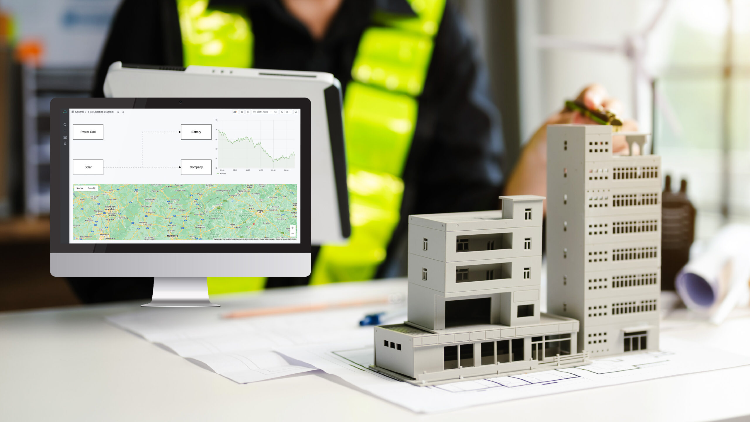
New visualization in the Time Series Data Service: The FlowCharting Diagram
Experience the new FlowCharting function in the Time Series Data Service. Create interactive flowcharts, visualise production cycles and devices, and animate them with KPIs. Make complex issues easy to understand and share knowledge throughout your organization. Try it out today!
The Time Series Data Service is becoming even more individual, as the “FlowCharting” visualization is now available. With this function, flow charts can be created in the Time Series Data Service, provided with KPIs and even animated.
Creating these diagrams is very simple: use the free Draw.io tool to draw your diagram. The visualization is ideal for flowcharts, but production cycles or devices can also be displayed well.
Here’s how it works: Create your diagram in Draw.io and insert the most important elements. Let’s take the energy flow from a PV system to the battery and to the company as an example. Assign corresponding IDs to the elements in the diagram and copy the XML code into the Time Series Data Service. There you can add metrics as usual and assign them to the corresponding elements using the IDs. Finally, define conditions and actions – and you’re done!
The Time Series Data Service makes it possible to capture complex facts more quickly and effectively. This means that knowledge is available to the entire company (or only to the authorised part, thanks to granular authorisations).
Other use cases? No problem! Visualize a production hall, for example, and use the machines to show what and how often a part has been produced in a certain time and the current status of the machine – interactively and easily understandable. If you can visualize it in a diagram, it also works in the Time Series Data Service.
Try it out today!
If you have any questions or are interested in live demos, please do not hesitate to contact us. Just get in touch with us!

