This article contains:
Select data
Select visualization
General options
To get started with creating your own dashboards, please click the small user icon in the bottom left corner, click the “Switch” button and then press the small “switch to” button right behind your email address.
From that point on, you’ve switched to your personal organization, which allows you to create your own private dashboards, which only you can access.
Once you switched to your own organization you can create new dashboards by selecting the [+] button in the left sidebar. This will create an empty dashboard.
A dashboard consists of panels, which can be arranged in a number of ways. A new panel can be added to the dashboard by clicking the [Add Panel] at the top of the screen.
Select data
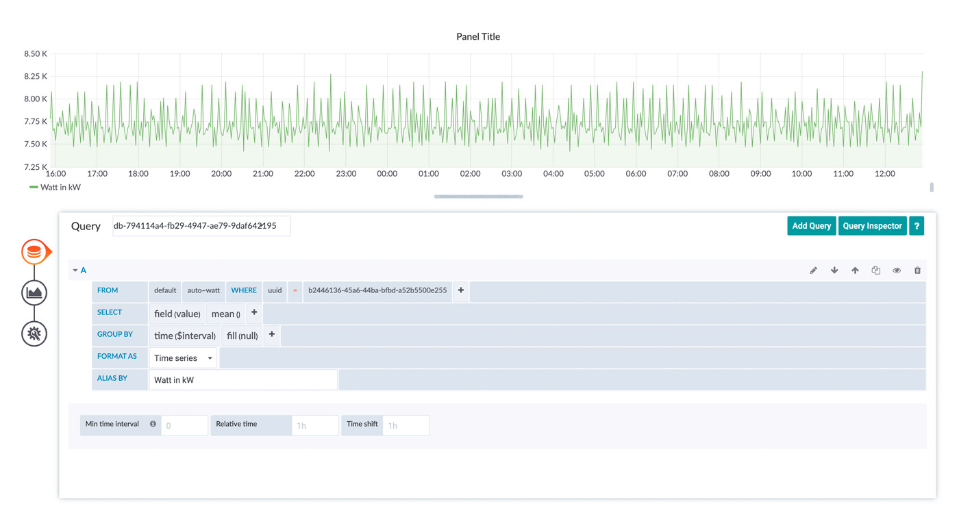
To retrieve data from your devices you must create a query. The query is sent to our cloud databases and provides you with the resulting data.
There is a graphical helper you can use to built your query in a point-and-click fashion.
- Click on [+] symbol on the left side of your screen, then on [Dashboard]
- Click on [Add Query] to start creating your new dashboard
- Select your data source from the dropdown right next to “Query”
- Build your query using the graphical editor
- Start by selecting a UUID in the “FROM”-row with clicking on the [+] right next to “where”
- Now select one of your UUIDs with a click on [select tag value]
- In the “FROM”-row, click now on [select measurement] so select what data should be displayed in your dashboard
- In the “SELECT”-row you now can change the field of the data inside the graph with clicking on the [+] next to “mean”
- In the “GROUP BY”-row you can set the interval of the data inside the graph
- You can give your data a new alias, with typing in a name in the row “ALIAS BY”
- If your data is written in a smaller frequency than in the “GROUP BY”-row, you can set it here
If there is anything wrong with your query, check the red exclamation mark at the top left of your panel
This is the easiest way of visualization, what you select depends on what you want to see. The best way to learn how the methods work is to try them out.
Select visualization
Click on the graph at the left side of the panel you worked with so far
This tool enables you to personalize the graphic. Click on the box [Graph] next to Visualization
Now you could choose which visualization you want to have for your measurement. There are a few visualization options that can be chosen from. It should be noted that not every visualization is suitable for every type of data.
What you see depends on what you select. The best way to learn how the methods work is to try them out.
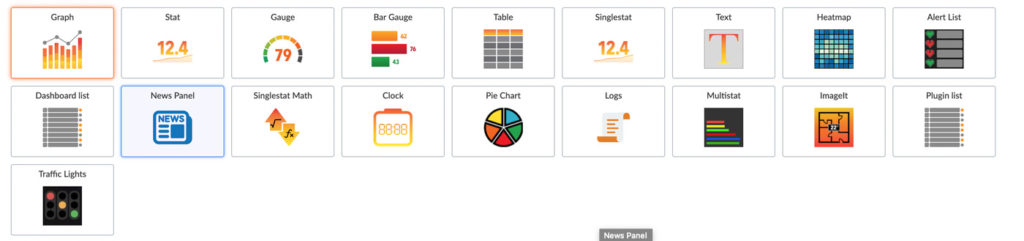
You can also add new visualization option using plugins or remove old ones you don’t need.
After Choosing a Visualization you can edit it to the extend you need to. Every Visualization has different settings ranging from changing the name to visualizing your data in different ways.
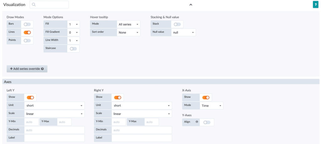
As an example, here you see the options for the Graph Visualization.
Now you can edit the visualization to the format you need. You could change the “Draw Mode” from Line to Bar, fill gaps with data, change the unit or scales of axes.
Just by trying the different type of options, you should get a greater understanding on how to make dashboards and personalize them.
General Options
In the box next to “Title” you can select the name of your Panel.
The option “Transparent” gives you the choice between a transparent and a nontransparent panel.
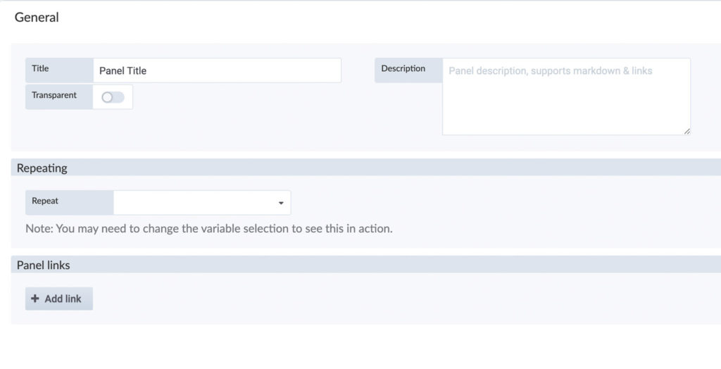
If you want, you can add a description, it supports markdown and links.