Energy Management Service FAQs
Everything you every wanted to know about the EMMA Service and how to use it.
You can change the order of metering points or metrics via drag and drop. The same works if you want to add a metric from the metric inbox to a property.
In the widgets of the EMMA Service, you can display data from individual metrics or from metering points.
The number next to a Metering Point indicates how many metrics are used within the nested structure. By clicking on the number, you can add more metrics to the Metering Points.
You can change the unit of a metric by clicking on the three dots to the right of the metric name and then on “Edit”. Here you can select a new unit for the metric.
The unit of a metric is displayed next to the name of the metric.
You can add a metric as often as you like. If you want to use an already added metric in a different view in the metric overview, you need to add the metric again.
You can rename metering points by clicking on the name of the metering point and assigning a new name directly.
You can usually recognize elements that you can edit or delete by the three dots on the right edge of the elements. Click on these three dots to see if you can delete or edit an element.
In EMMA service you can create as many levels in your properties as you want. There is no limit.
Example: Country → City → Building → Floor → Workgroup → Machine → Sensor …
The selection of KPIs has been moved to the selection of units when creating a widget. This allows you to use KPIs even more intuitively.
In the Metrics Inbox you will find all metrics registered in the EMMA service, which you have not been placed in the tree structure yet.
In EMMA service there is a selection of icons that you can assign to Metering Points. After you have added a metering point, you can click on the default icon and get the possibility to set a new icon for this metering point.
To add a metric in the EMMA service, you need devices on Proficloud.io in your organization that provide data. You can add this data in the EMMA service by clicking on the “+” in the metrics list and selecting, for example, the device from the Device Management Service. Now assign the appropriate unit and you will find the metric in the Metric Inbox after adding it.
To do this, simply click on the “+” and add a Metering Point to your Metrics list. To create “Child” Metering Points, click on the three dots on the right side of the Metering Point to which you want to add a child Metering Point and click on “Add Child”.
In the EMMA Service, data, metrics as well as metering points can be provided with individual colors. Just click on the icon of the element (metric or metering point). Here you can set the color of the elements.
You can change colors in dashboards by clicking on the list in the widgets on the three dots of the displayed elements and selecting the color here.
Metrics in dashboards whose color has been changed are color-coded by name.
A Metering Point is, among other things, a management unit in the EMMA service. Sub-points or metrics can be assigned to it. Metrics assigned to subordinate metering points are automatically summed up in the parent element. Metering points can be used in the same way as metrics in the visualizations.
In the EMMA Service, properties can be reflected in the EMMA service with update 1.10. Simply use the option of nesting individual metering points in the metrics overview.
To do this, simply click on the “+” and add a Metering Point to your Metrics list. To create “Child” Metering Points, click on the three dots on the right side of the Metering Point to which you want to add a child Metering Point and click on “Add Child”.
With these options you can map your real building/company structure in the EMMA service.
EMMA service visualization options include 8 visualization options and some statistical options for some visualization options.
Energy Bar Chart – Consumer over Consumer
Energy Bar Chart – Period over Period
Energy Pie Chart – Consumer over Consumer
Energy Pie Chart – Period over Period
Energy Pareto Chart – Ranked by Consumer
Energy Pareto Chart – Ranked by Period
Power Line Chart – Consumer over Consumer
Power Line Chart – Period over Period
Energy Bar Chart – Consumer over Consumer
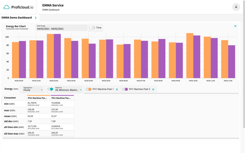
This widget enables to compare energy data for several consumers side-by-side over the same time period. The data is shown in a bar chart.
Statistical values
- min : The minimum of all shown bar series per consumer with their timestamps
- max: The maximum of all shown bar series per consumer with their timestamps
- mean: The mean value of all shown bar series per consumer
- std dev: The standard deviation of all shown bar series per consumer
- all time min: The lowest value which ever appeared within this energy time series data per consumer
- all time max: The highest value which ever appeared within this energy time series data per consumer
Energy Bar Chart – Period over Period
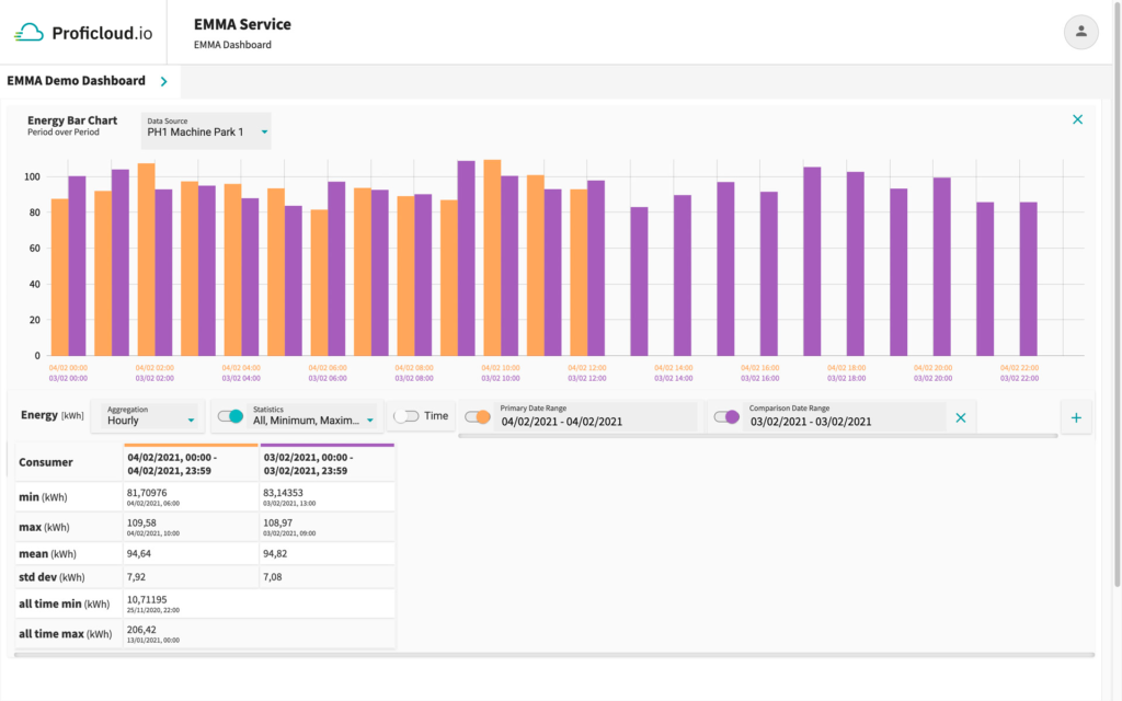
This widget enables to compare energy data of different time periods side-by-side for the same consumer. The data is shown in a bar chart.
Statistical values
- min : The minimum of all shown bar series per date range with their timestamps
- max: The maximum of all shown bar series per date range with their timestamps
- mean: The mean value of all shown bar series per date range
- std dev: The standard deviation of all shown bar series per date range
- all time min: The lowest value which ever appeared within this energy time series data for that single consumer
- all time max: The highest value which ever appeared within this energy time series data for that single consumer
Energy Pie Chart – Consumer over Consumer
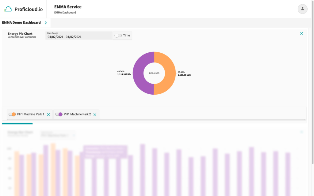
This widget enables to compare energy data for several consumers over the same time period. The data is depicted in a pie chart with their absolute values and as a percentage distribution of the different consumers’ consumption.
Energy Pie Chart – Period over Period
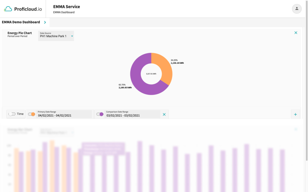
This widget enables to compare energy data of different time periods for the same consumer. The data is depicted in a pie chart with their absolute values and as a percentage distribution of the consumptions for different time periods.
Energy Pareto Chart – Ranked by Consumer

This widget shows energy data for several consumer aggregated over a selected time period. The information is shown in a combined bar and line chart. A bar depicts the total value for the chosen date and time range per selected consumer. The bars are arranged from highest energy consumption to lowest. The chart includes a cumulative curve.
Application Example:
The user may use this widget to perform an 80/20 analysis, identifying those energy measurement devices that together make up the 80 % of the overall energy consumption.
For gaining this quick insight the user can set a threshold value, e.g. 80 %, which will be displayed as a dashed green line within the chart.
The energy measurement device at the crossing point and the ones on the left from the crossing point between the threshold line and the cumulative percentage curve make up 80 % of the total consumption.
In the shown example PH 1 Machine Park 1 and PH 1 Machine Park 2 make up 80 % of the total consumption for the 29/04/2021.
Energy Pareto Chart – Ranked by Period
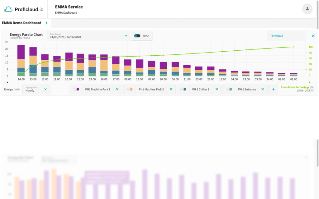
This widget shows energy data for several consumer aggregated over a selected time period. The information is shown in a combined bar and line chart. A bar depicts the stacked sum of all chosen consumers for a particular period of time according to the chosen aggregation level, e.g. 15min, hourly, daily etc. The bars are arranged from highest energy consumption to lowest. The chart includes a cumulative curve.
Application Example:
The user may use this widget to perform an 80/20 analysis, identifying those time intervalls of a certain time range that together make up the largest portion of 80% of the overall energy consumption during that time range.
Power Line Chart – Consumer over Consumer
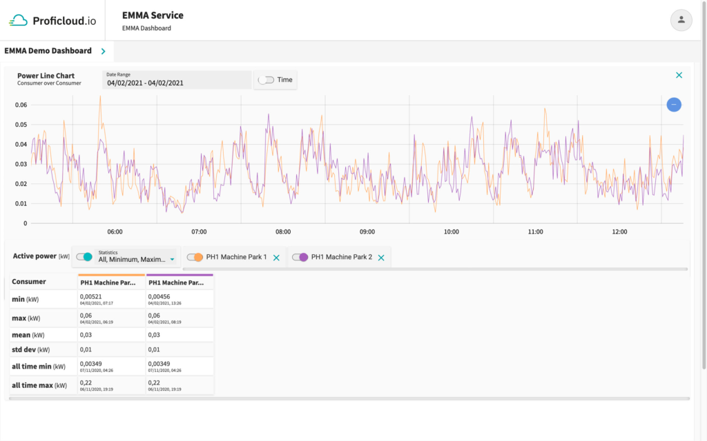
This widget enables to compare power data for several consumers. It represents the consumers’ load profile over a certain time period. The data is depicted in a line chart.
Statistical values
- min: The minimum of all data points for the chosen date range per consumer with their timestamps
- max: The maximum of all data points for the chosen date range per consumer with their timestamps
- mean: The mean value of all data points for the chosen date range per consumer
- std dev: The standard deviation of all data points for the chosen date range per consumer
- all-time min: The lowest value which ever appeared within this power time-series data per consumer
- all-time max: The highest value which ever appeared within this power time-series data per consumer
Power Line Chart – Period over Period
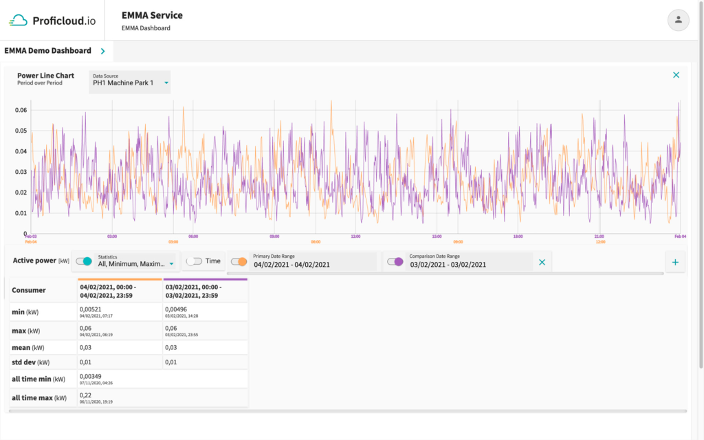
This widget enables to compare power data of different time period for the same consumer. It represents the consumer’s load profile for these different time periods. The data is depicted in a line chart.
Statistical values
- min: The minimum of all shown all datapoints per date range with their timestamps
- max: The maximum of all shown all datapoints per date range with their timestamps
- mean: The mean value of all shown all datapoints per date range
- std dev: The standard deviation of all shown all datapoints per date range
- all-time min: The lowest value whichever appeared within this power time series data for that single consumer
- all-time max: The highest value whichever appeared within this power time series data for that single consumer
You can select temporal aggregation for all widgets that compare time periods. To do this, you just need to click the [Aggregation ▾] drop-down box at the bottom left of the widget and select the appropriate time period.
Timeframe: Several hours up to three days
If you have chosen a timeframe from several hours up to 3 days, you are able to get the following aggregated Energy values displayed:
- 15min
- Hourly
If the hours add up to at least one full day, you are able to choose also daily Energy.
Timeframe: More than three days up to one month
If you have chosen a timeframe more than 3 days and up to a month, you are able to get the following aggregated Energy values displayed:
- Hourly
- Daily
If the days add up to at least one full week, you are able to choose also weekly Energy.
Timeframe: More than a month
If you have chosen a timeframe from more than a month, you are able to get the following aggregated Energy values displayed:
- Daily
- Weekly
- Monthly
If the months add up to full years you are able to choose also yearly Energy.
Timeframe: More than a year
If you have chosen a timeframe of at least one year, you are able to get the following aggregated Energy values displayed:
- Weekly
- Monthly
- Yearly
You can create a new widget in the EMMA Service in four simple steps. Just click the [New Widget] button at the top of the screen. If you have already created several widgets, the button is located under the already created widgets.
You can find the available widget types and their properties here: What visualization options do I have?
You can adjust the time range of each widget individual by clicking on the button [Date Range] at the top right corner of a widget. Clicking on the Date Range button will open a date selector, where you can click once on a date for the “From”-date and click on another date for the “To”-date. With a click on [Apply] you can save the settings and the widget will be refreshed with the new date range.
The data recorded by devices in the EMMA Service can be exported as a CSV file with just a few clicks.
- Open the EMMA Service
- Click on [Export Energy Data] in the lower part of the EMMA Service.
- Select one or more devices
- Select the time period
- Click on [Export Data]
To be able to compare data from different sources, the EMMA Service offers the functionality of data import. Here you can import energy or air pressure data.
- Open the EMMA Service
- Click on [New virtual device] in the lower area of the EMMA Service.
- Select the CSV option for the CSV import.
- In the next step, you can drag and drop the file you want to import into the box with the dashed line, or click [Browser Files] to select the file in Explorer
- After you have selected a CSV file, choose which data you want to import, you have the choice between “Energy” and “Pressure”.
- With a click on Import you can now import the data like any other device in the EMMA Service
You can create reports in the EMMA service that allow you to set up EnPIs. To use the report feature, you need at least one active dashboard.
- Open the EMMA service
- Click on [Reports] in the left navigation under “EMMA Service”.
- You can now select the dashboards for which you want to create a report
- In the same line you can select the date. The reports will automatically be adjusted to the week and month of the day you have selected.
- You can now decide if you want to enrich the reports with the produced quantity
- In the areas of the day, the week and the month you can enter the produced quantity to evaluate the energy consumption per set metric.
- With a click on [Download] you can download the report and send it as a PDF file.
- Open the EMMA Service
- Click on [Alerts] in the left navigation under “EMMA Service”
- Click on [New Alert rule]
- Select the Notification Type (as of June 2022, Proficloud.io notifications are possible)
- Select the criticality level of the notifications (Low, Medium, High)
- Now select the metric (as of June 2022, Energy is possible)
- New options for triggers appear, select from hourly, daily or weekly
- Select whether you want to be notified when the threshold value is exceeded or not reached
- Enter the limit value
- Now select one or more devices to be monitored
- Click on [Create Alert rule] to save the alert

