EMMA service visualization options include 8 visualization options and some statistical options for some visualization options.
Energy Bar Chart – Consumer over Consumer
Energy Bar Chart – Period over Period
Energy Pie Chart – Consumer over Consumer
Energy Pie Chart – Period over Period
Energy Pareto Chart – Ranked by Consumer
Energy Pareto Chart – Ranked by Period
Power Line Chart – Consumer over Consumer
Power Line Chart – Period over Period
Energy Bar Chart – Consumer over Consumer
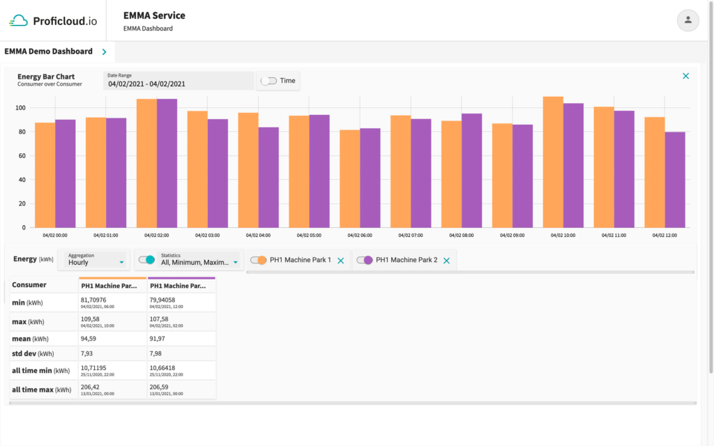
This widget enables to compare energy data for several consumers side-by-side over the same time period. The data is shown in a bar chart.
Statistical values
- min : The minimum of all shown bar series per consumer with their timestamps
- max: The maximum of all shown bar series per consumer with their timestamps
- mean: The mean value of all shown bar series per consumer
- std dev: The standard deviation of all shown bar series per consumer
- all time min: The lowest value which ever appeared within this energy time series data per consumer
- all time max: The highest value which ever appeared within this energy time series data per consumer
Energy Bar Chart – Period over Period
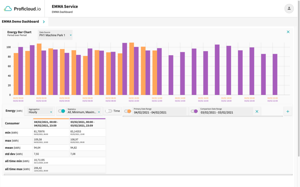
This widget enables to compare energy data of different time periods side-by-side for the same consumer. The data is shown in a bar chart.
Statistical values
- min : The minimum of all shown bar series per date range with their timestamps
- max: The maximum of all shown bar series per date range with their timestamps
- mean: The mean value of all shown bar series per date range
- std dev: The standard deviation of all shown bar series per date range
- all time min: The lowest value which ever appeared within this energy time series data for that single consumer
- all time max: The highest value which ever appeared within this energy time series data for that single consumer
Energy Pie Chart – Consumer over Consumer
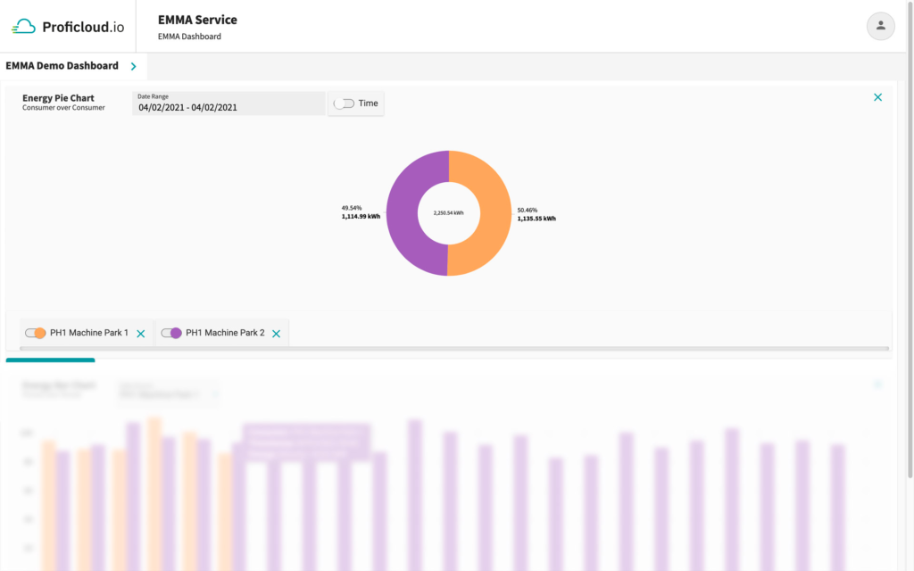
This widget enables to compare energy data for several consumers over the same time period. The data is depicted in a pie chart with their absolute values and as a percentage distribution of the different consumers’ consumption.
Energy Pie Chart – Period over Period
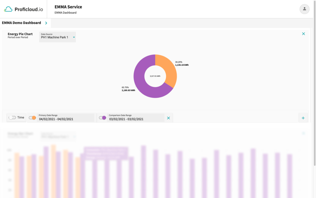
This widget enables to compare energy data of different time periods for the same consumer. The data is depicted in a pie chart with their absolute values and as a percentage distribution of the consumptions for different time periods.
Energy Pareto Chart – Ranked by Consumer

This widget shows energy data for several consumer aggregated over a selected time period. The information is shown in a combined bar and line chart. A bar depicts the total value for the chosen date and time range per selected consumer. The bars are arranged from highest energy consumption to lowest. The chart includes a cumulative curve.
Application Example:
The user may use this widget to perform an 80/20 analysis, identifying those energy measurement devices that together make up the 80 % of the overall energy consumption.
For gaining this quick insight the user can set a threshold value, e.g. 80 %, which will be displayed as a dashed green line within the chart.
The energy measurement device at the crossing point and the ones on the left from the crossing point between the threshold line and the cumulative percentage curve make up 80 % of the total consumption.
In the shown example PH 1 Machine Park 1 and PH 1 Machine Park 2 make up 80 % of the total consumption for the 29/04/2021.
Energy Pareto Chart – Ranked by Period
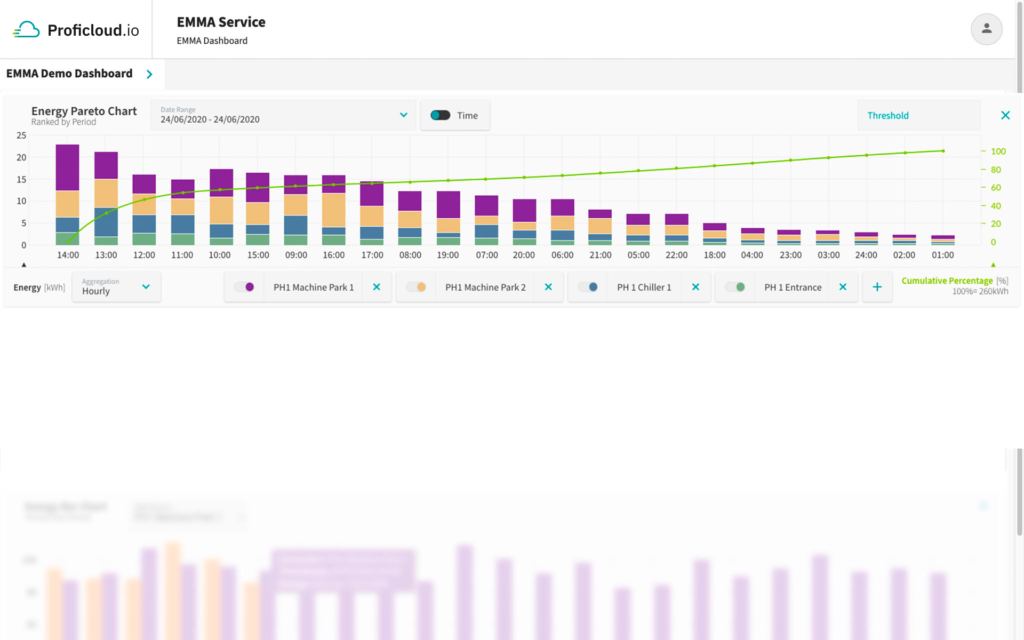
This widget shows energy data for several consumer aggregated over a selected time period. The information is shown in a combined bar and line chart. A bar depicts the stacked sum of all chosen consumers for a particular period of time according to the chosen aggregation level, e.g. 15min, hourly, daily etc. The bars are arranged from highest energy consumption to lowest. The chart includes a cumulative curve.
Application Example:
The user may use this widget to perform an 80/20 analysis, identifying those time intervalls of a certain time range that together make up the largest portion of 80% of the overall energy consumption during that time range.
Power Line Chart – Consumer over Consumer
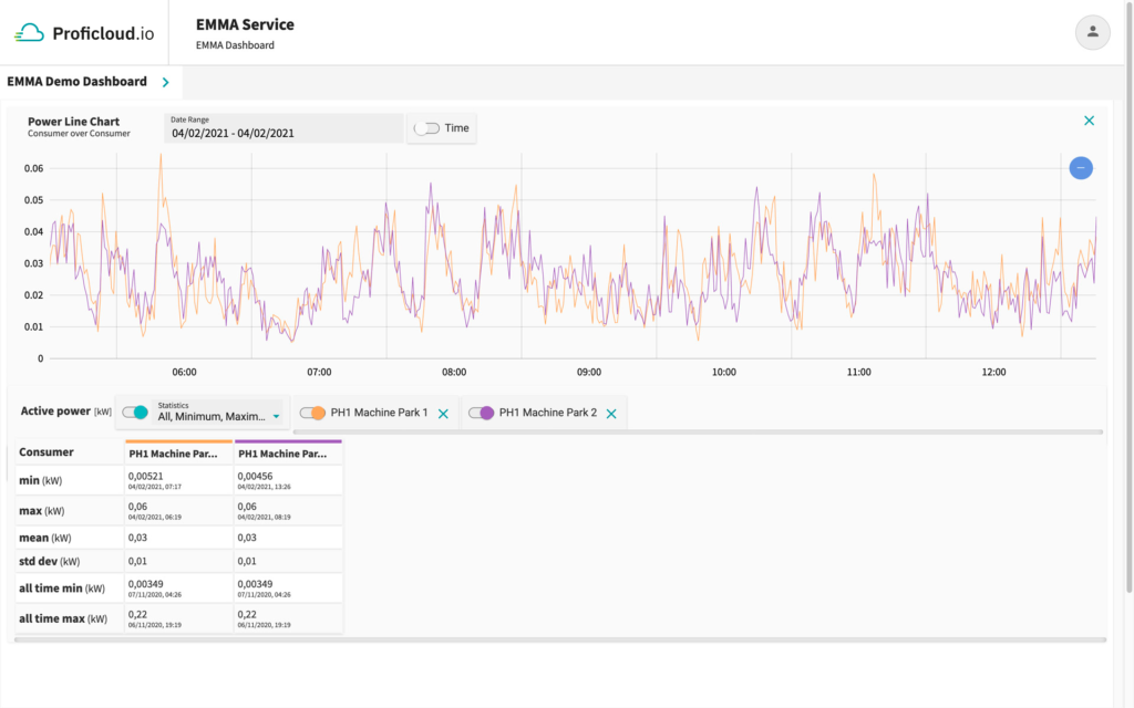
This widget enables to compare power data for several consumers. It represents the consumers’ load profile over a certain time period. The data is depicted in a line chart.
Statistical values
- min: The minimum of all data points for the chosen date range per consumer with their timestamps
- max: The maximum of all data points for the chosen date range per consumer with their timestamps
- mean: The mean value of all data points for the chosen date range per consumer
- std dev: The standard deviation of all data points for the chosen date range per consumer
- all-time min: The lowest value which ever appeared within this power time-series data per consumer
- all-time max: The highest value which ever appeared within this power time-series data per consumer
Power Line Chart – Period over Period
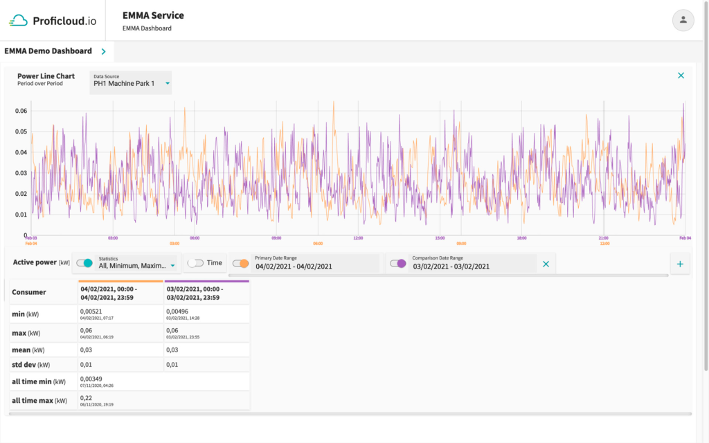
This widget enables to compare power data of different time period for the same consumer. It represents the consumer’s load profile for these different time periods. The data is depicted in a line chart.
Statistical values
- min: The minimum of all shown all datapoints per date range with their timestamps
- max: The maximum of all shown all datapoints per date range with their timestamps
- mean: The mean value of all shown all datapoints per date range
- std dev: The standard deviation of all shown all datapoints per date range
- all-time min: The lowest value whichever appeared within this power time series data for that single consumer
- all-time max: The highest value whichever appeared within this power time series data for that single consumer

